
With over 40 years in the global market and on the verge of becoming the world leader in apple and pear concentrate production, Jugos S.A. decided to bring its visual identity up to par with its commercial and operational reality.
Client:
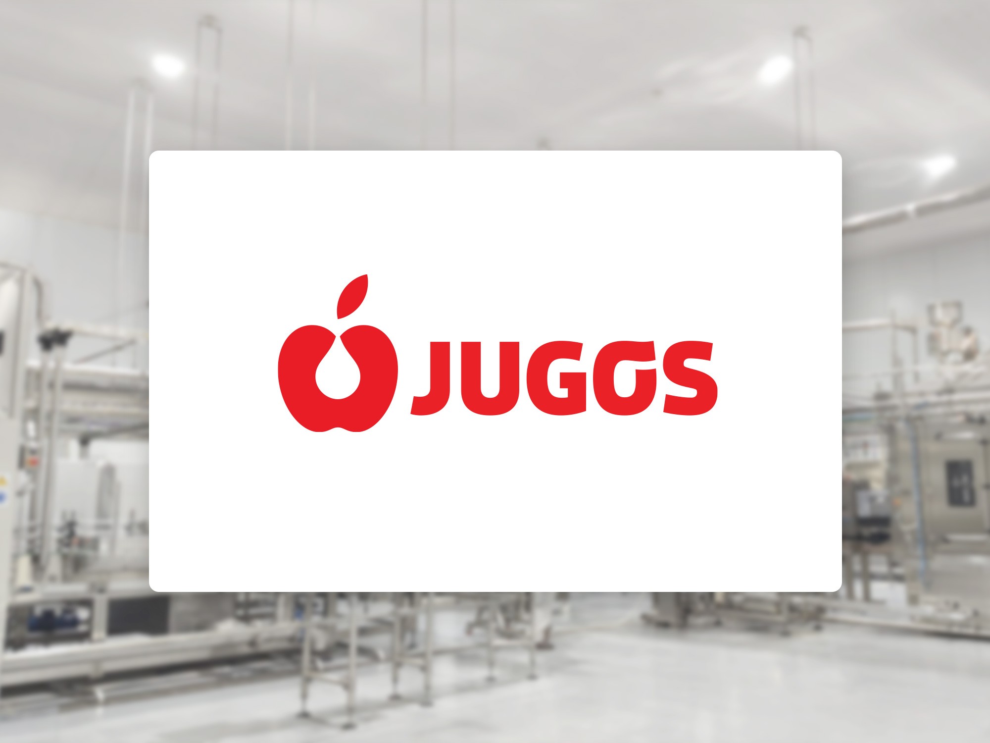
Jugos S.A.
Service:
Visual Identity and Editorial Design
Agency:
GZB&CV
Year:
2018

/Problem
Identity design within the highly mediated context of B2B industrial production.
This case marked my first experience working within a large-scale, globally operating industry.
It was my first encounter with the specific challenge of dealing directly with middle management and complex internal bureaucratic structures—a system far more layered than I had been accustomed to.
It was also the first time my primary audience was not the end consumer, but another large-scale industry of comparable structure and complexity.
The first and most important task, therefore, was to understand this new context and determine how to translate the usual design process into its specific constraints, particularly in how proposals were presented and defended.
An additional challenge came from the company’s deeply conservative institutional value system and its self-perception of success through work, both of which fostered a static culture resistant to any change perceived as drastic.
This proved to be a significant obstacle when proposing shifts in institutional identity — as I would experience throughout the project.


/Approach
In a context resistant to change, it is crucial to propose beyond the acceptable in order to negotiate a middle ground that represents a meaningful symbolic gain.
Based on preliminary research into the company’s history, operations, and expectations, I developed an initial round of visual proposals that reflected the commercial reality the company was experiencing at that time.
The central axis of my first proposal was to shift the brand’s narrative focus from raw material to product — from natural to industrial, from local to international.
It was a bold step the company ultimately chose not to take, but one that nonetheless allowed for significant improvements in key elements of the visual identity:
A substantial redesign of the logotype, aligning it with the company’s operational scale and institutional dimension.
A reduction of the color palette to a single hue, to ensure visual consistency and homogeneity across all media and reproduction formats.
The adoption of a single type family to be used throughout all company communications — internal and external, promotional and relational alike.


/Conclusions
In practice, the possibilities offered by design do not necessarily imply their feasibility.
In the B2B industrial sector it is important to rapidly identify this “feasibility boundary” in order to properly calibrate expectations regarding the project’s scope.
In this engagement I was surprised by the final gap between the possibilities that the problem presented and the solutions that were ultimately approved and implemented. It was a significant lesson regarding the initial client assessment and the early scoping of the project.
The outcome represented a positive evolution of Jugos S.A.’s visual identity, particularly in relation to the operational function of identity elements. In that respect the project was satisfactory. Perhaps the time will come when an evolution of its core narrative becomes truly viable.


