The visual update of a high-value brand and the challenge of not redesigning everything.
Client:
Italia Farmacias
Service:
Identity and Digital Presence
Year:
2020-2021
/Problem
Updating the identity system and expanding it into the digital realm.
Italia Farmacias is a family business founded in 1984 by its current owner, later joined by two of her sons. The pharmacy prospered thanks to sound management through difficult times, taking advantage of opportunities with intelligence and hard work. It currently operates through two strategically located branches that together cover the largest possible area of the city.
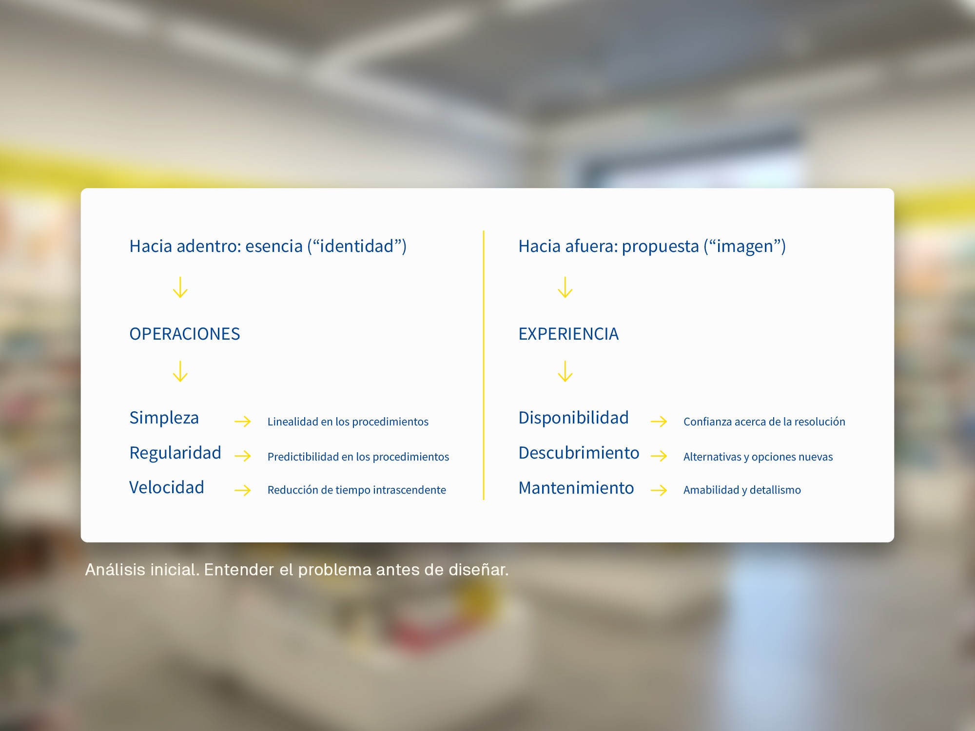
It is primarily recognized for its availability and diligence, which constitute the brand’s core values and are expressed operationally through the wide range of products and services offered, extended opening hours, and the excellent customer service consistently provided by its staff — all constants over decades of local market presence.
All this accumulated value was being threatened by incipient communication obsolescence. The business was falling behind its local competitors in terms of digitalization and needed to reassess how well its visual identity aligned with this new stage of development. However, the owners were reluctant to lose the essence of their visual identity, which had strong positive recognition in the local market and was built primarily around a logo and a two-color institutional palette.

/Approach
Perfecting a predefined identity by understanding its values.
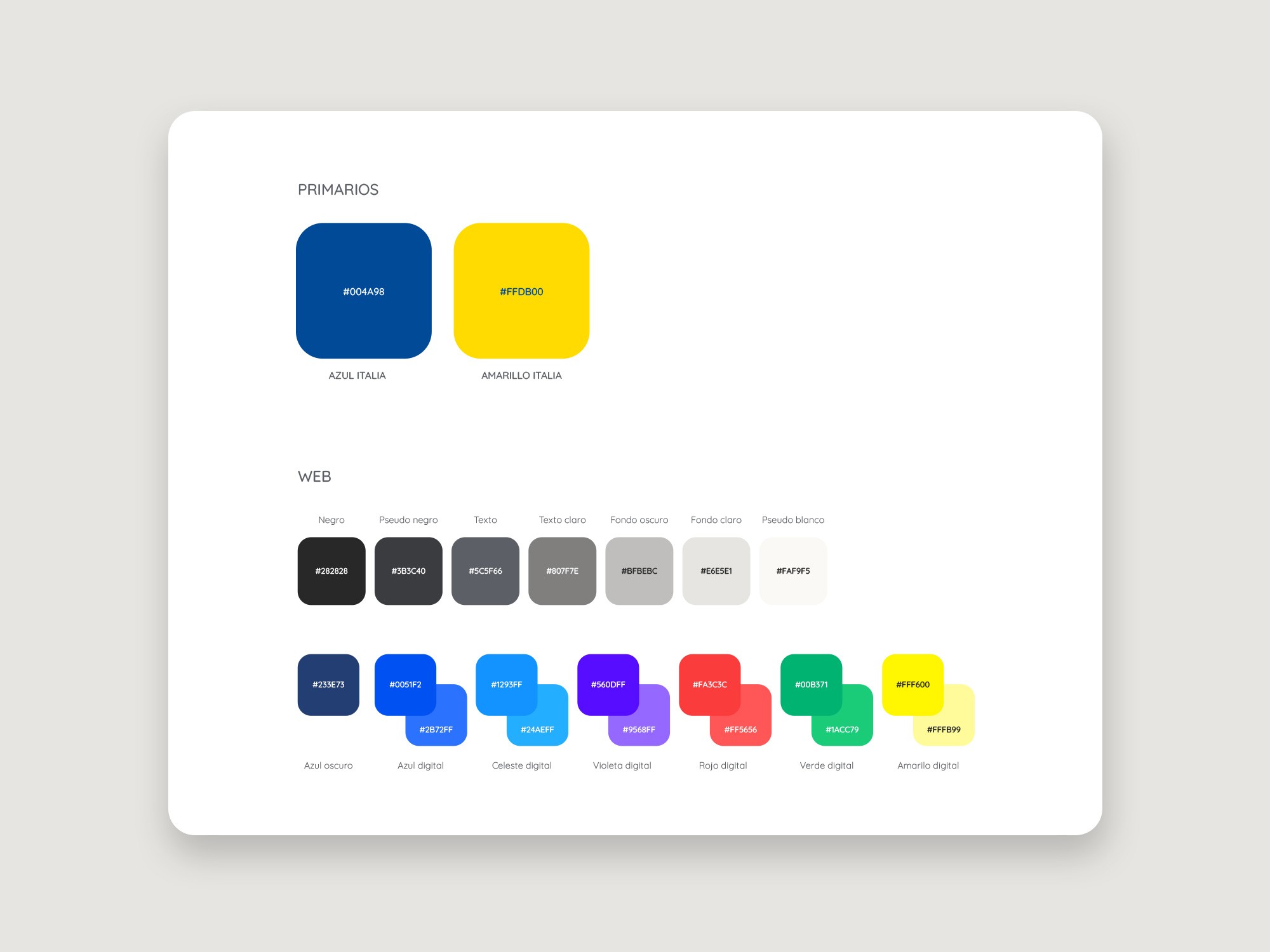
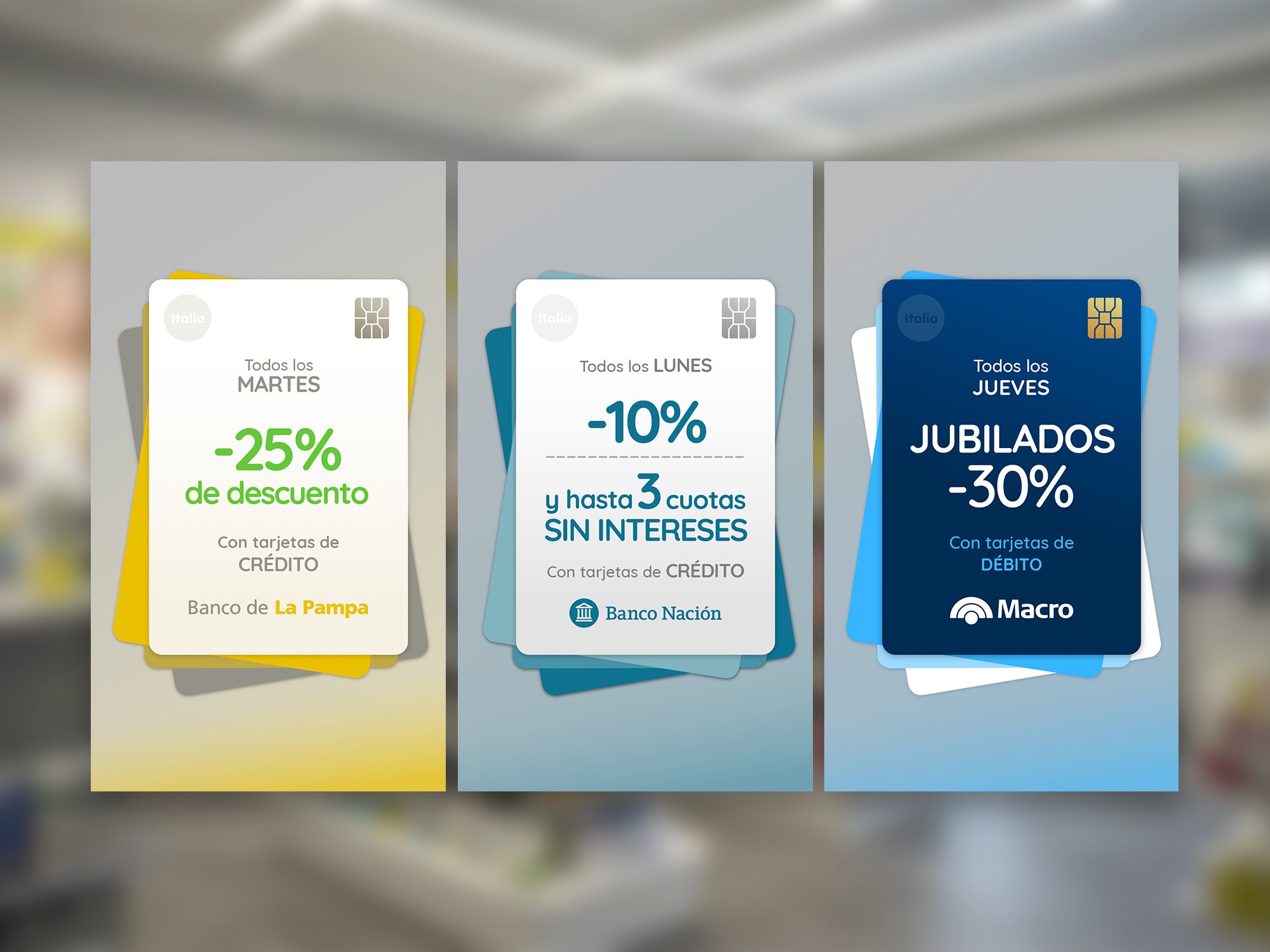
I chose a conservative approach, rebuilding the logo from scratch but avoiding any perceptual dissonance with the original in order to preserve its accumulated value. I applied the same logic to the institutional colors, extending the chromatic system to meet the demands of the digital medium. Finally, I selected a catalog typeface that would allow for typographic consistency across all brand communications — something that had previously lacked a clear organizing principle.
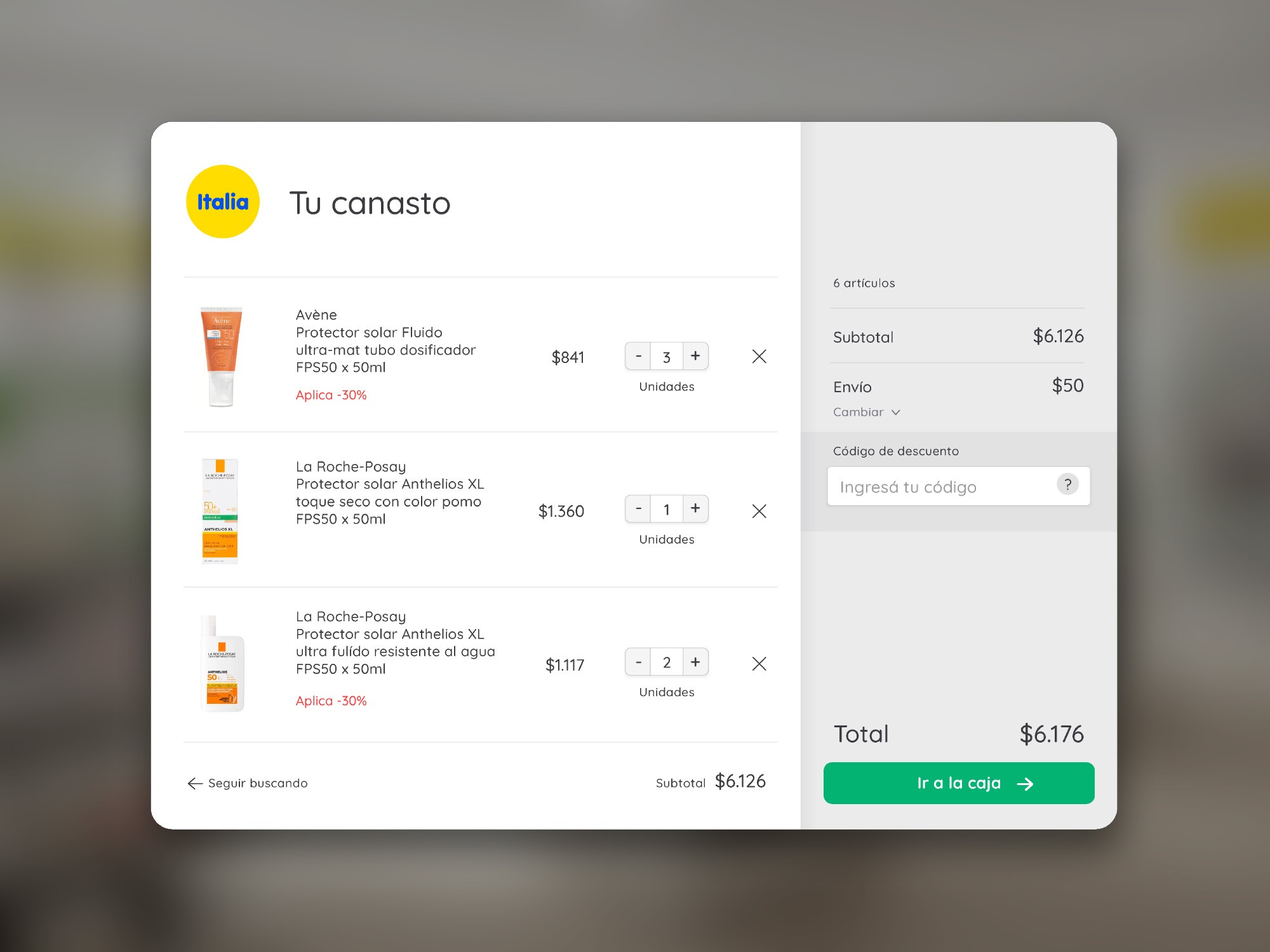
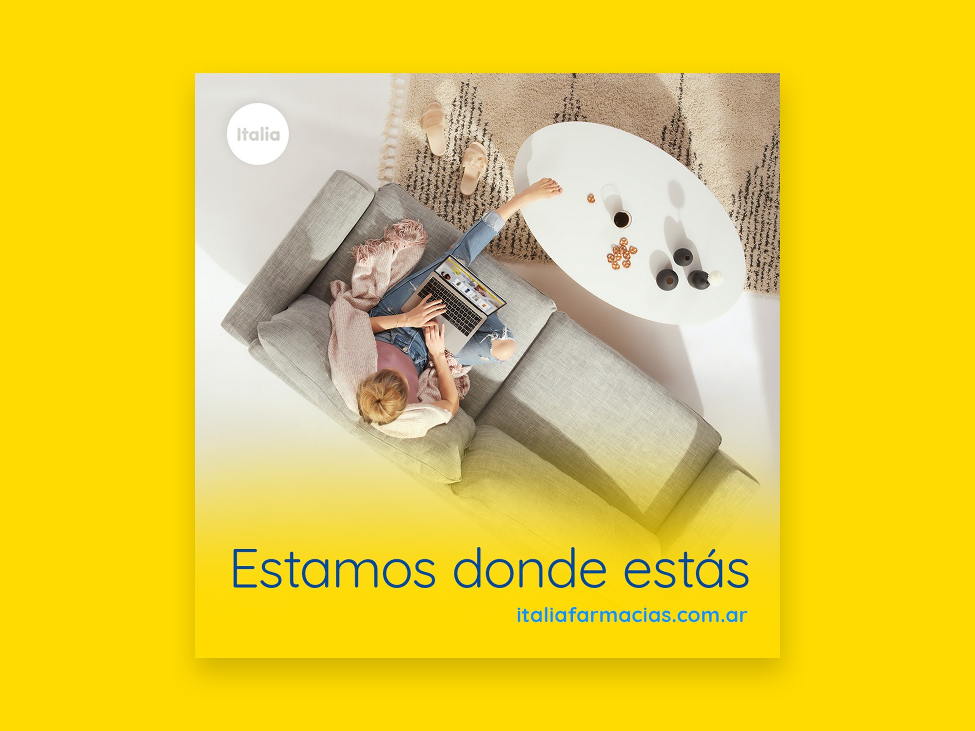
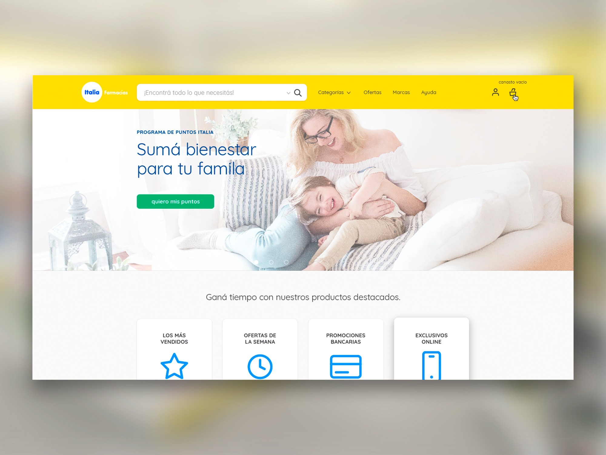
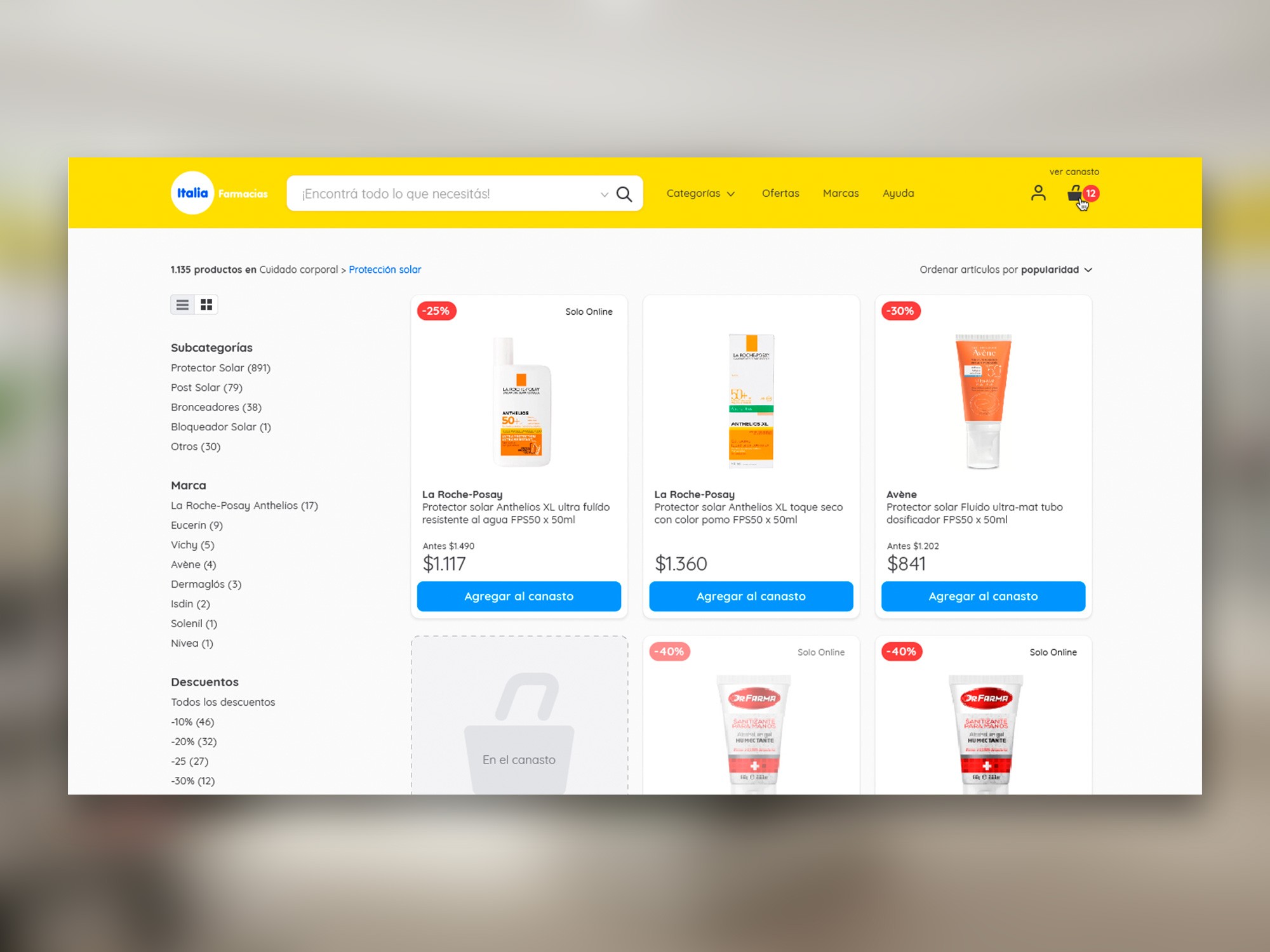
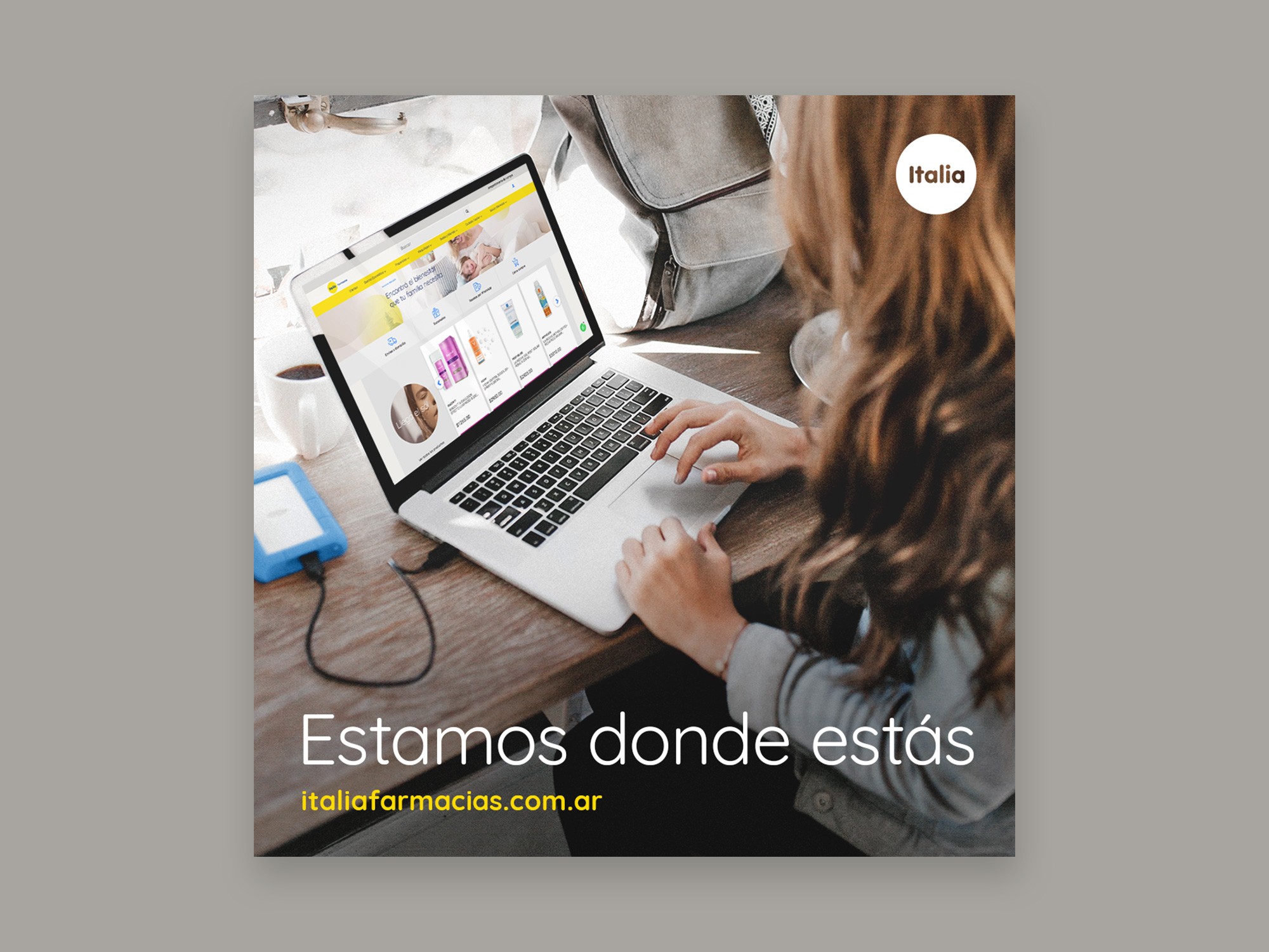
Based on these basic visual system components, I developed a series of graphic assets for both digital and physical contexts: an online store, social media content, in-store signage, calendars, and other collateral materials — all designed to perceptually convey the sense of operational professionalism that defines the company.
/Conclusions
Knowing what to preserve can generate more value than changing everything.
It is not always evident that a redesign project involving a long-standing identity requires pausing and taking distance before acting. Failing to do so may result in a loss of symbolic value greater than any perceived gain. Disorder can often be mistaken for emptiness, leading to the waste of latent, non-evident brand equity.
The initial organization of any identity update project should include a stage of discrimination between what fails from a design perspective because it poorly expresses something valuable, and what truly lacks value even if it is technically well executed. The outcome can lead to a task diagram entirely different from the one suggested by an external, initial glance at the problem.