Visual identity for an artisanal winery, its flagship wine, and its annual enotourism event.
Client:
Moschini Family
Service:
Identity / Packaging / Collateral
Agency:
GZB&CV
Year:
2015-2018

/Context
Develop the identity for a series of diverse products and services belonging to a small family-owned agribusiness.
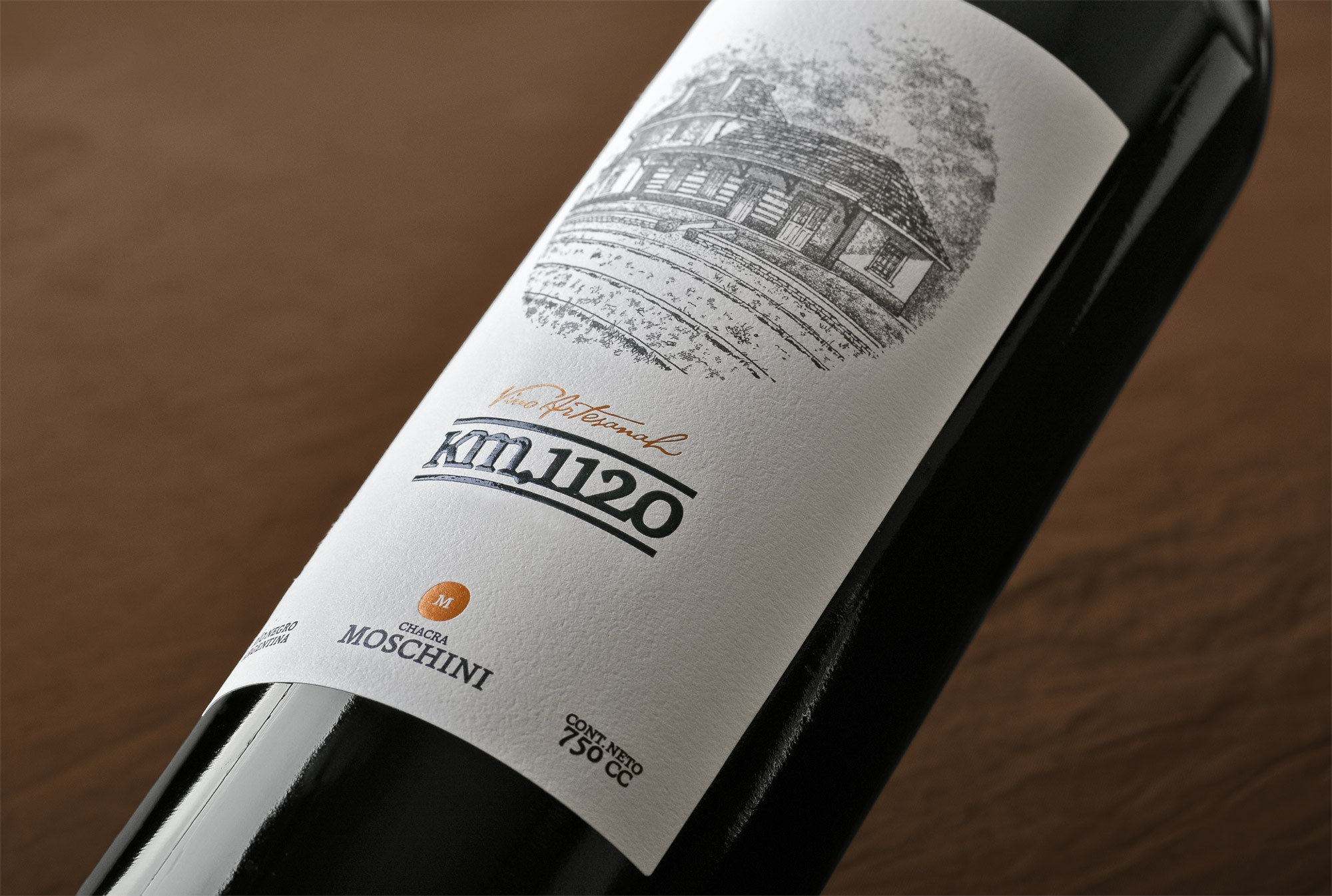
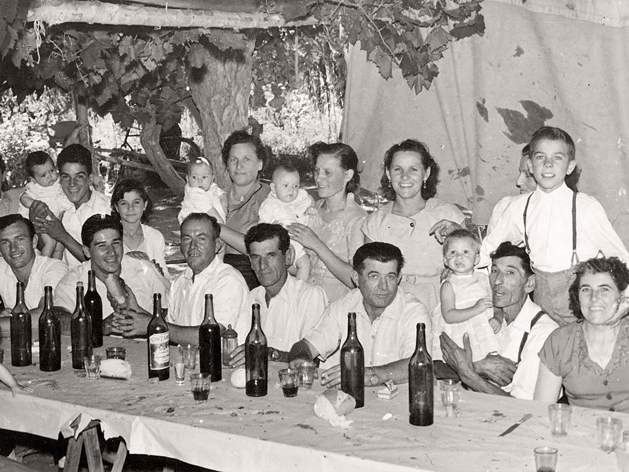
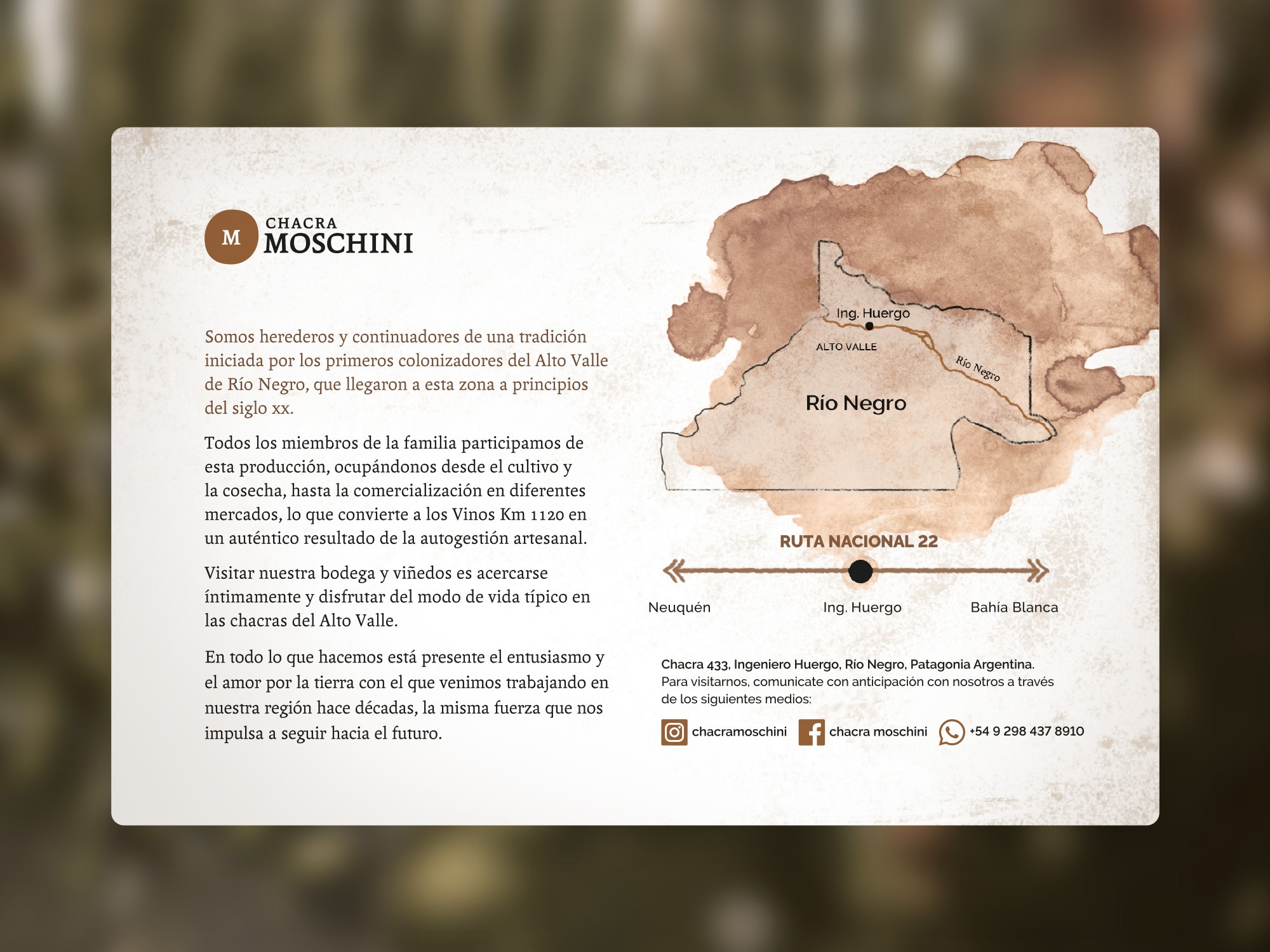
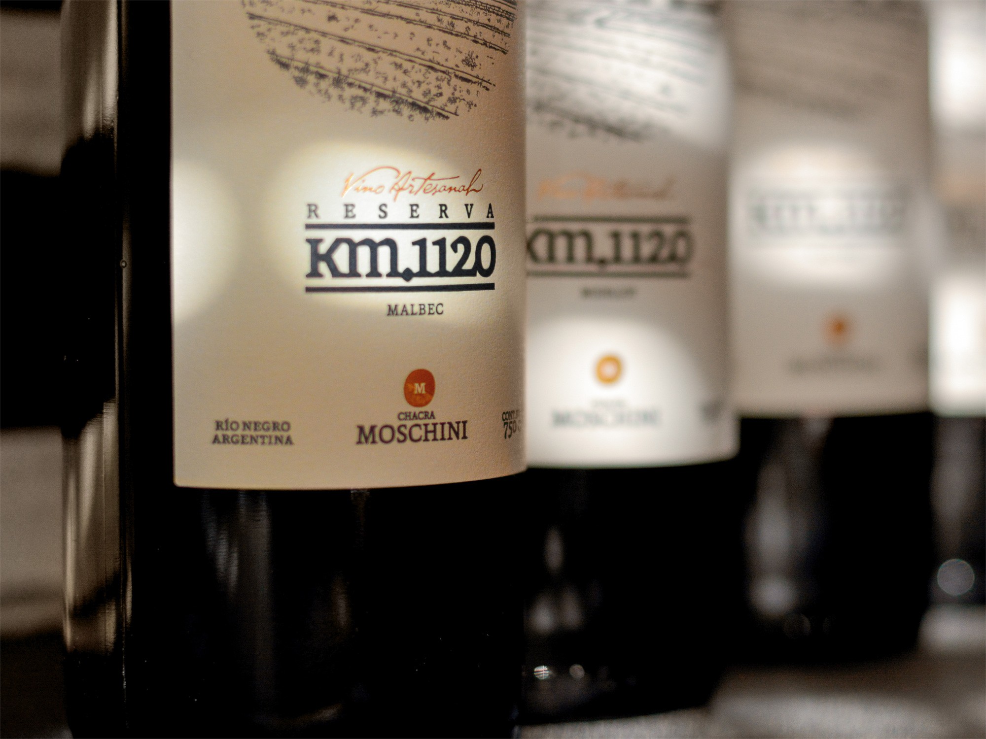
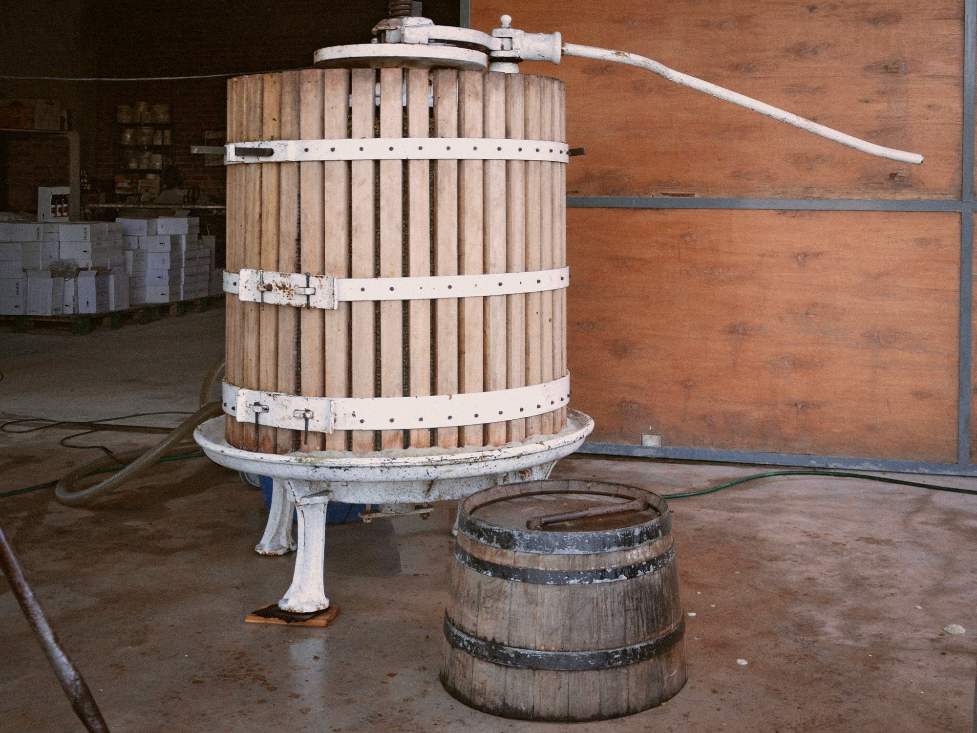
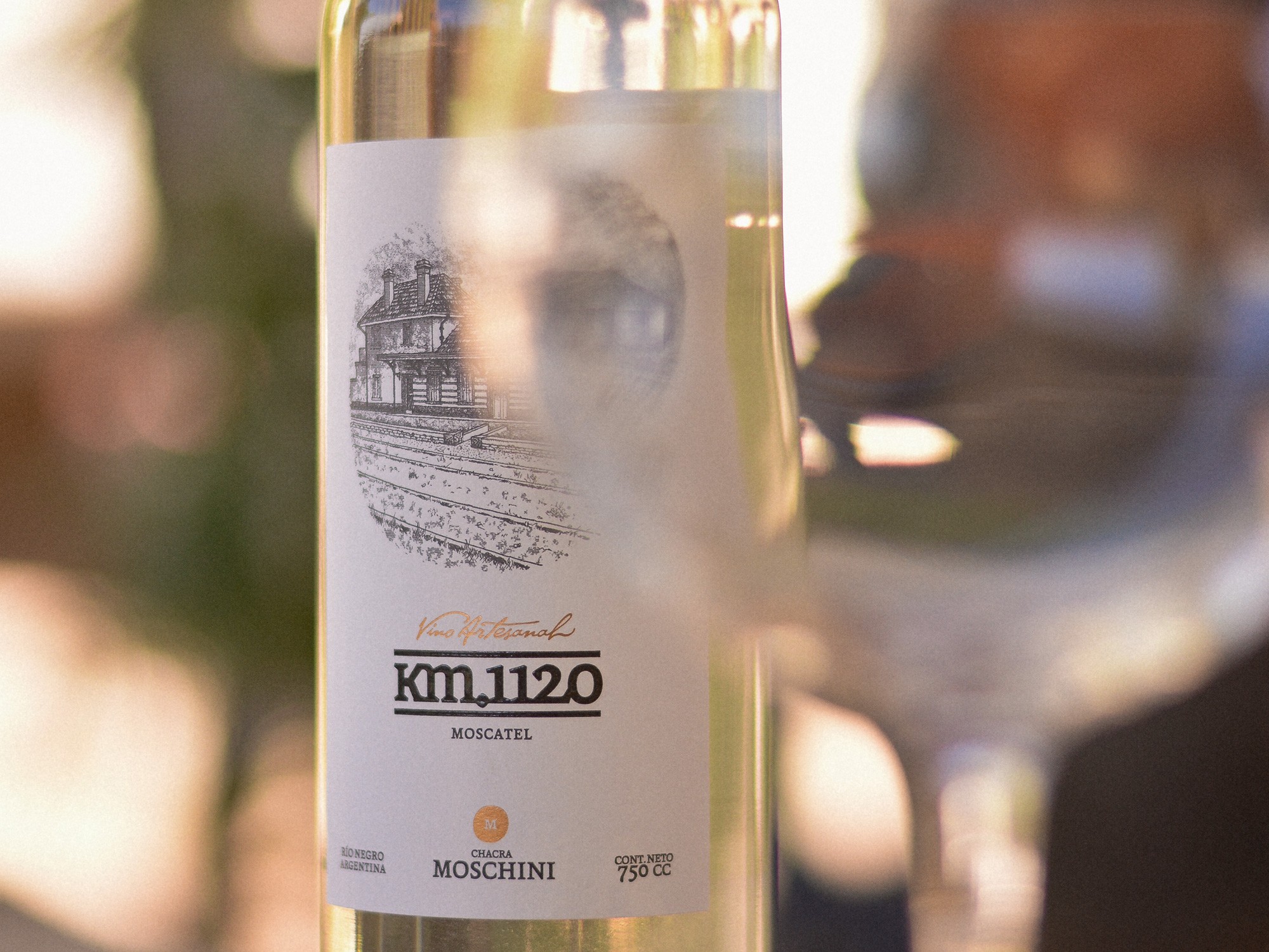
The Moschini family sought to improve the visual expression of their artisanal flagship wine, Km 1120, and to give a defined identity to their small winery. They had been producing and marketing their wines by hand for several years and felt it was time to formalize that activity.
In addition, over the years they had developed a range of products and services surrounding their agricultural operations, but without any structured work on the visual and commercial expression of that offering — something they also wished to organize and present more coherently.
The initial challenge was to define a clear brand architecture strategy that would allow this heterogeneous offering to be expressed through a unified and consistent value and morphological proposal.
This required deciding which products or services would be unified under a single brand system, and which would remain only linked through specific morphological traits within the overall identity.
/Approach
Positioning the family and their estate as the face and umbrella of a heterogeneous offering, in order to unify it in value terms.
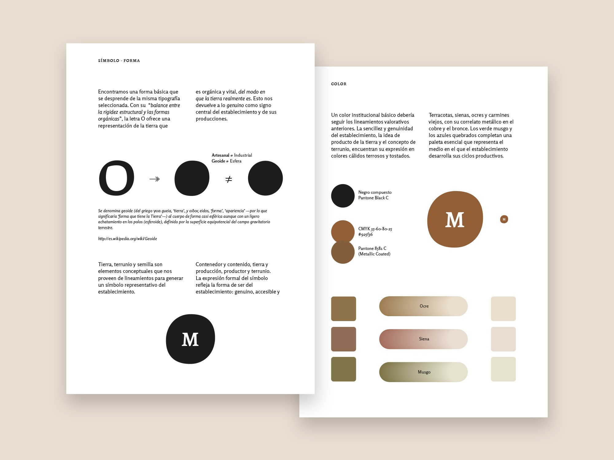
The branding proposal focused on defining the family estate, rather than the winery itself (as initially conceived), as the central and unifying axis of the entire offering.
This approach made it possible to construct a core narrative based on a set of integrative essential values that could shape all products and services, without resorting to a complex brand architecture — something inappropriate for the scale and operational rhythm of the enterprise.
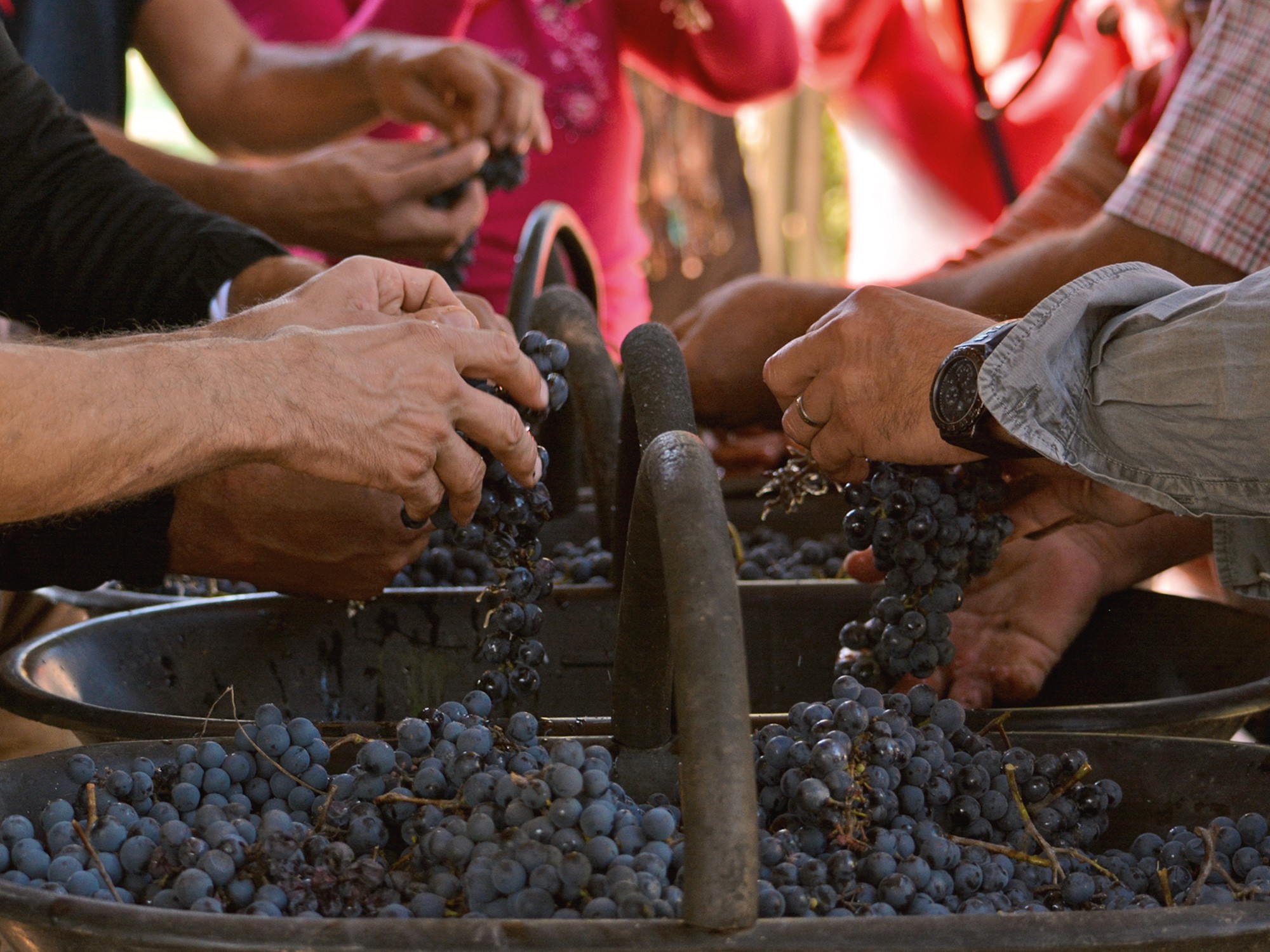
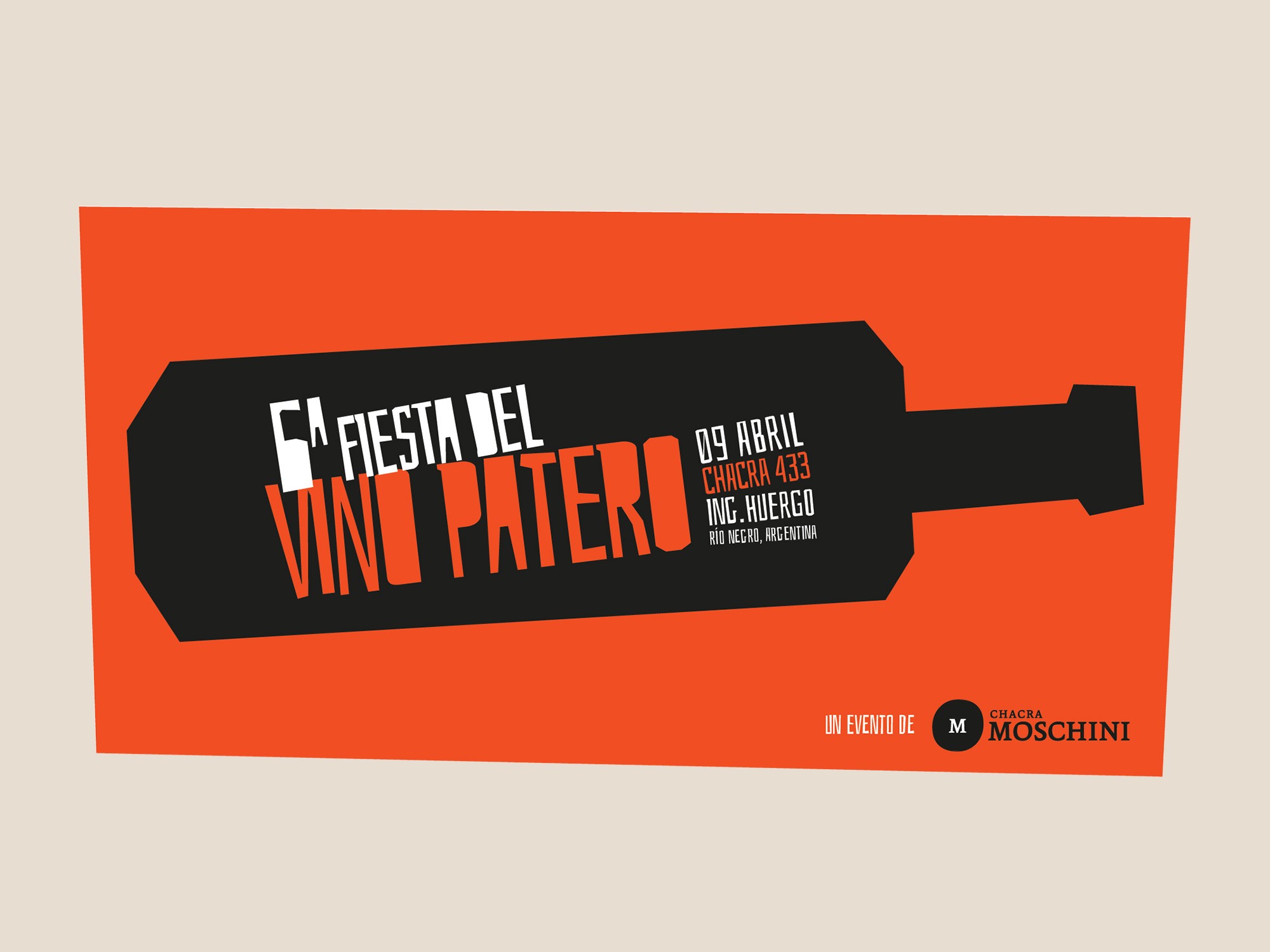
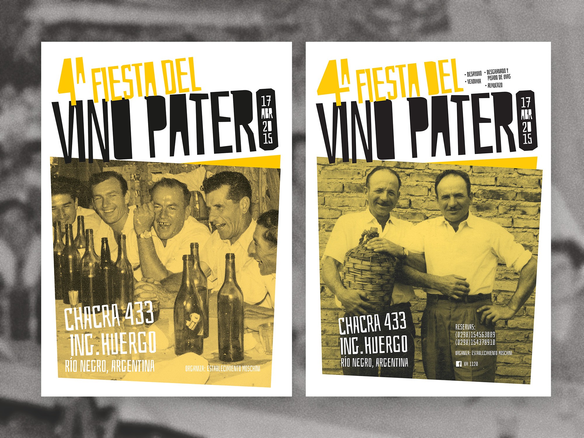
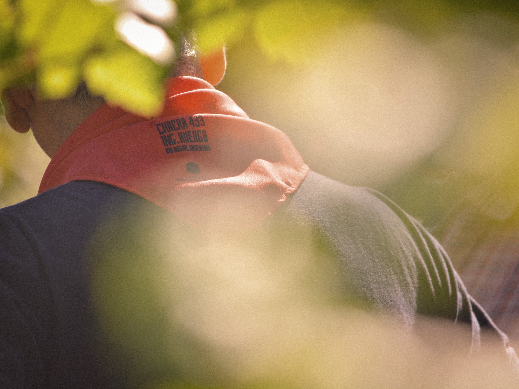
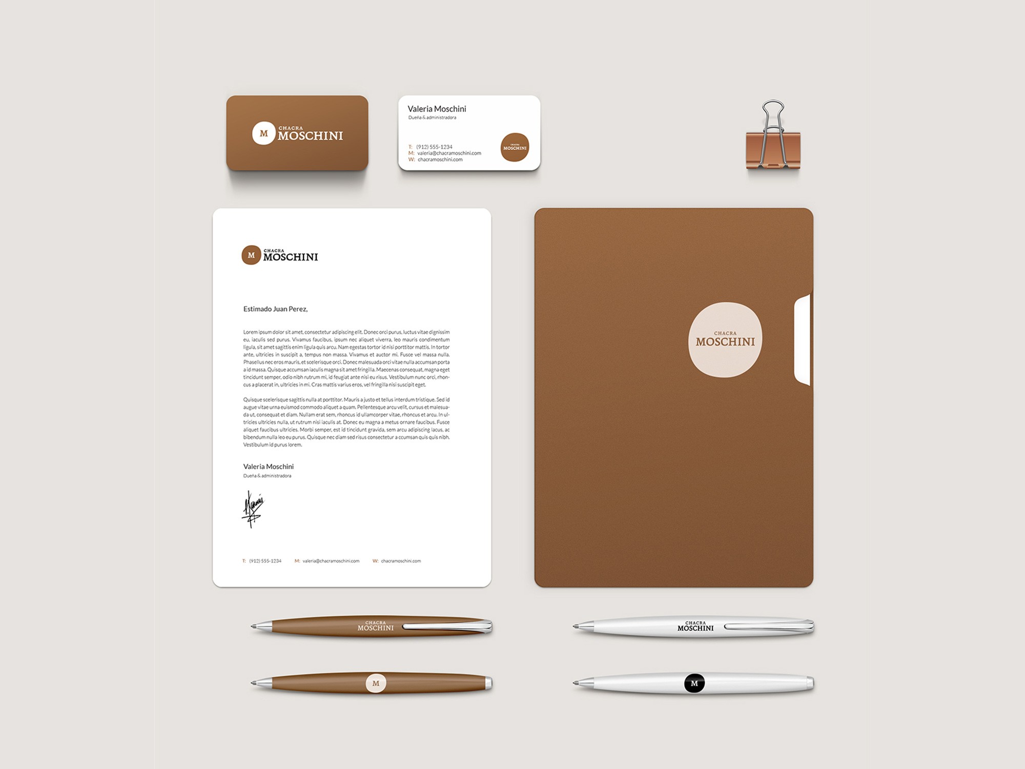
The result was Chacra Moschini, a root brand firmly anchored in the traditional values of Italian rural heritage and the local terroir, with a heterogeneous set of extensions: wines, liqueurs, jams and preserves, rural lodging, regional cuisine, and enotourism.
Generosity, friendship, work, nature, and cultural and family roots—free of vanity or pretense—constitute the language of a genuine, simple, and robust morphological proposal, built from spartan yet sincere elements, conceived to endure over time.
/Conclusions
The value of accompaniment over the urgency of a typical project.
Beyond strategic or technical design aspects, this project revealed that small artisanal producers benefit far more from continuous guidance throughout the evolution of their commercial offering than from a single, definitive intervention framed within the typical timing of a branding project.
Their operational development is slower and their roadmaps less predictable than those of conventional companies of similar size. These are not the preferred clients for most agencies, which partly explains the limited brand development and the underuse of design as a catalyst for commercialization within this market segment.
Finding effective ways to help these artisanal ventures promote their offerings in traditional markets remains a challenge for branding studios that require a minimum viable return on time invested.
The solution may lie in reorganizing project timelines and studio–client communication models, understanding that the value created—and its eventual return—extends far beyond the purely economic.