Logo design, application on everyday objects, and identity proposal for a micro-enterprise that designs and markets medical devices. (Project on hold.)
Client:
Ayelen Weber
Service:
Visual Identity
Year:
2020
/Context
A nutritionist, her physiotherapist husband, her seamstress mother — and an inevitable venture born in pandemic times.
Until 2020, the workwear market was relatively small and quite stable. The pandemic, among countless other disruptions, triggered a rapid expansion of this market, instantly attracting new players. This saturation of supply caused brand proposals—previously almost nonexistent, since workwear was considered purely technical and operational—to gain in sophistication, creating a newly complex landscape of elaborated offers.
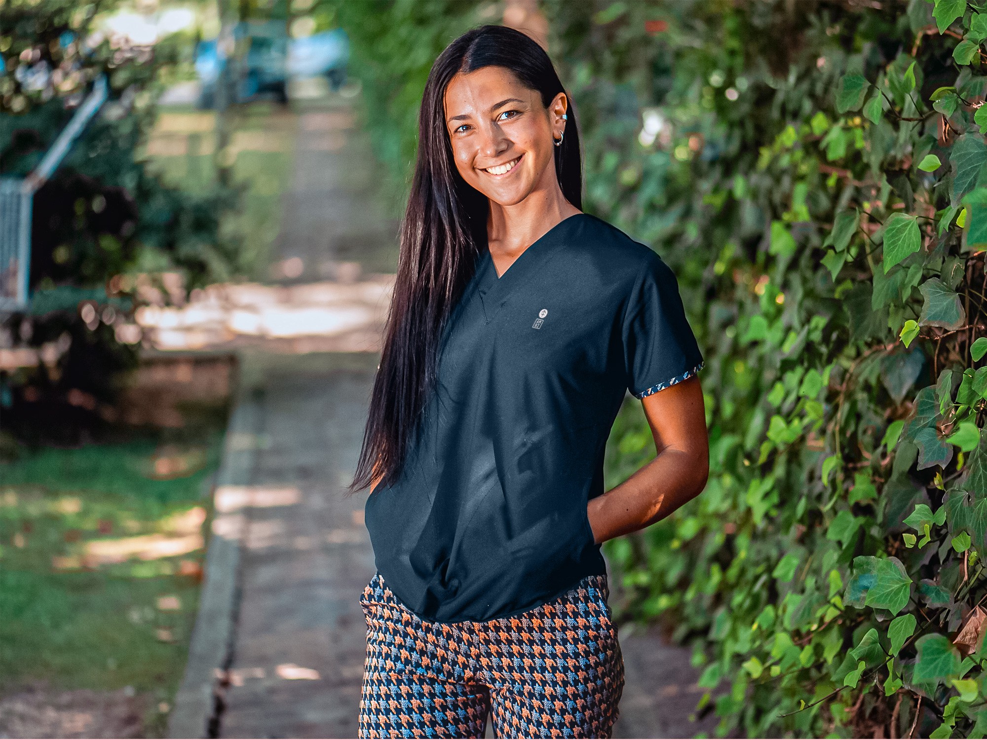
It was within this context that the client decided to launch a medical scrubs brand.
She possessed the know-how to design and produce garments, was immersed in the healthcare environment, and had a natural affinity for fashion and apparel. The venture was practically served on a platter.
From the technical standpoint, she knew she wanted to compete through refined design, quality tailoring, and a wide variety of textures and patterns in fabrics. That naturally led to envisioning a brand proposal capable of matching that level of sophistication.
/Concept
The visual expression of values sustained by the new generation entering the labor market.
The first decision was to base the identity’s development on the interests and value systems of university students and young professionals, without limiting the approach to their professions or work contexts.
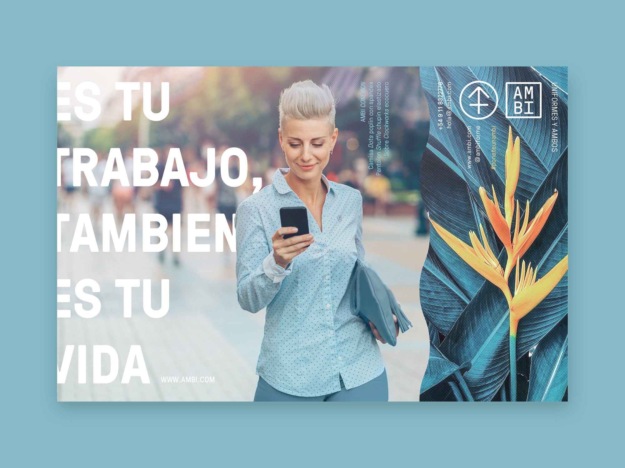
Among these values, special relevance was given to gender discourse and the deconstruction of traditional behavioral structures, where the professional environment already played a central role — together with the increasingly diffuse boundary between work and leisure, productivity and entertainment.
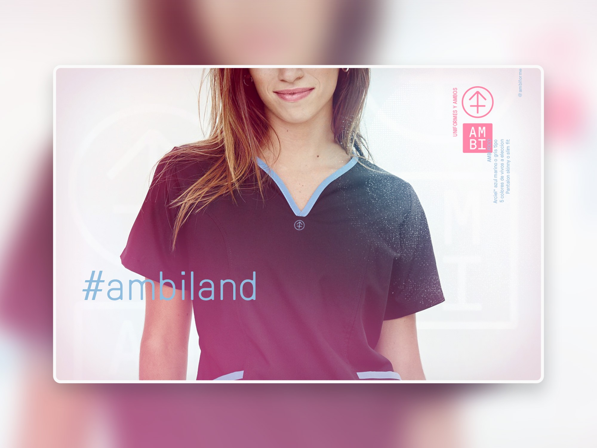
This dissolution of polarization across activities, attitudes, and modes of conduct automatically established the concept of ambivalence as the main axis and motive of the brand’s identity, becoming the thematic thread guiding the search for a distinct visual and discursive style.
/Morphology
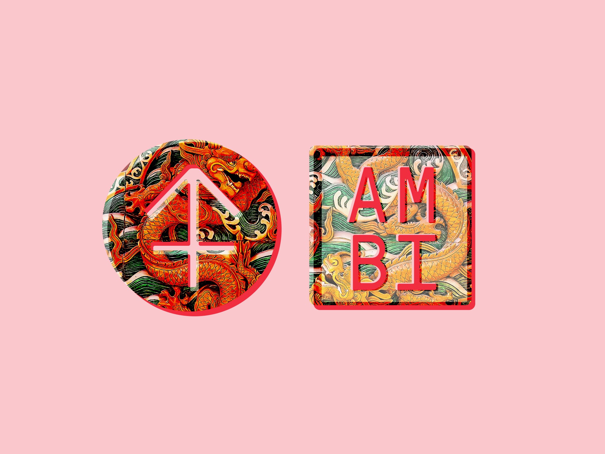
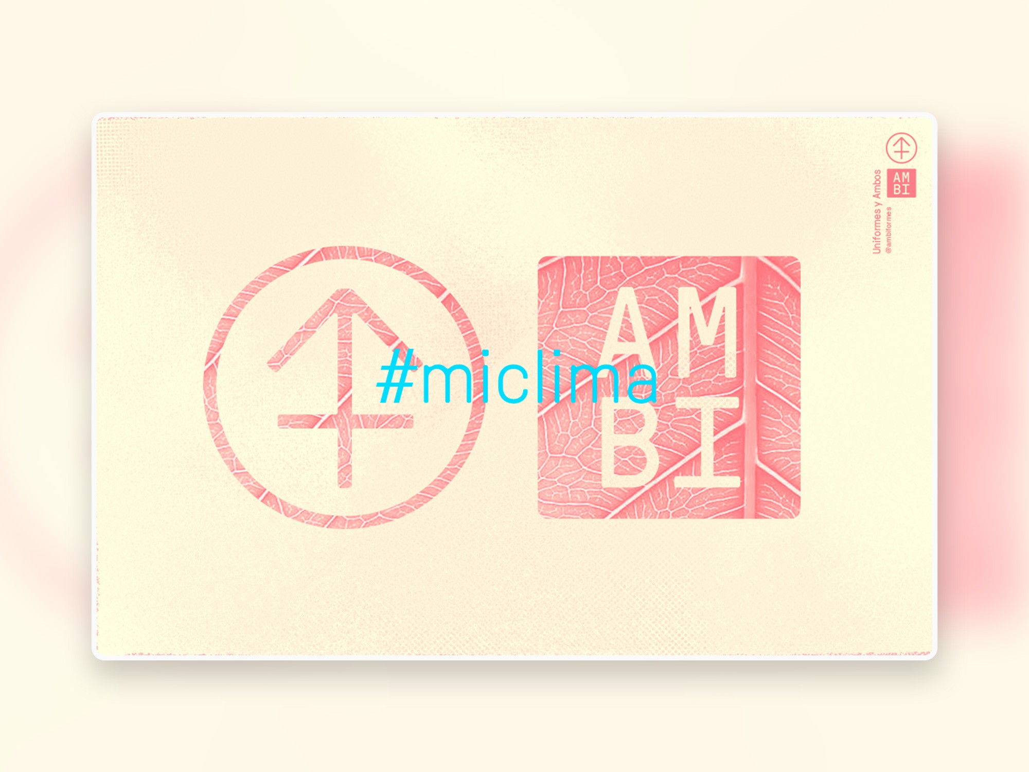
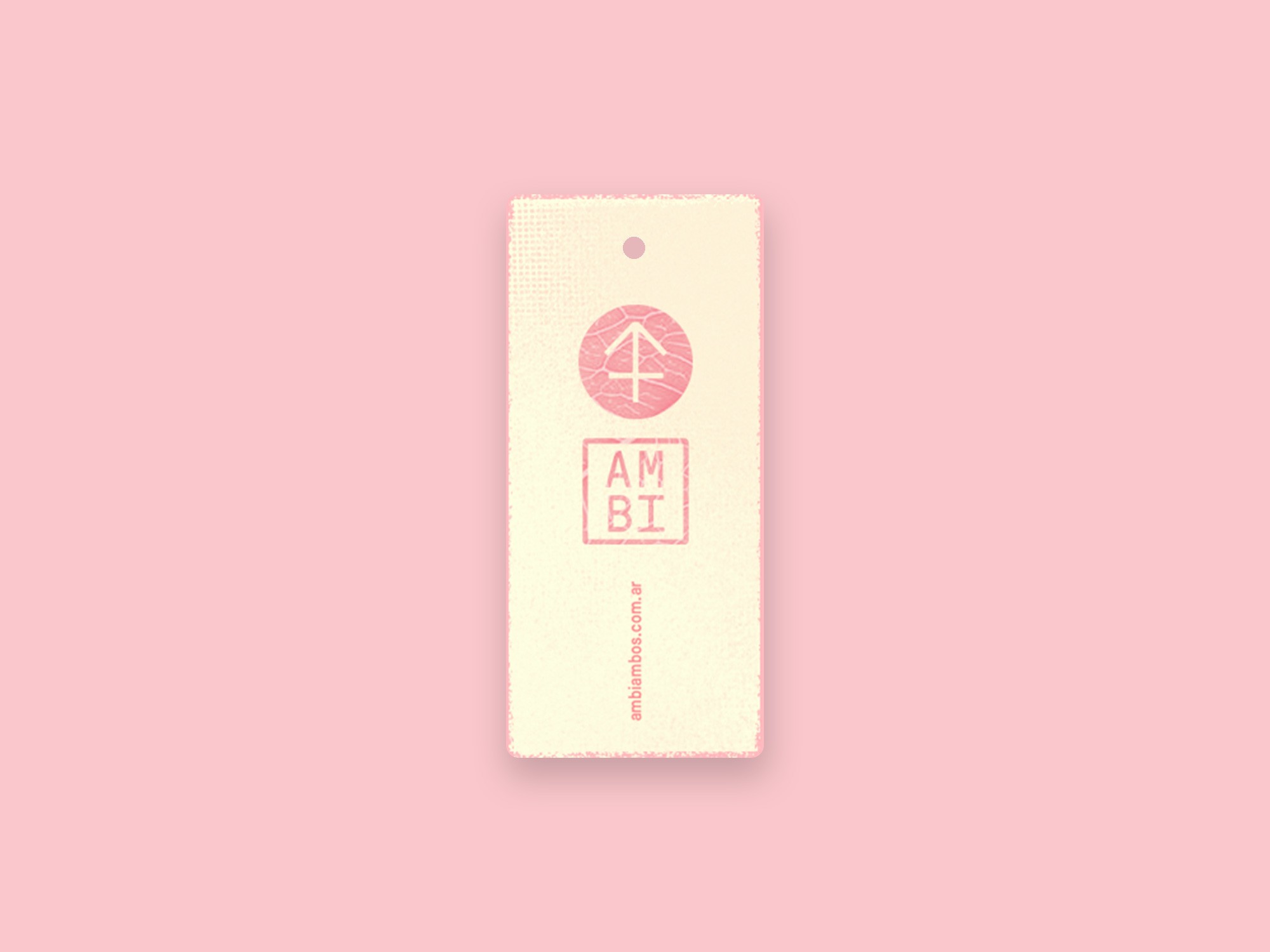
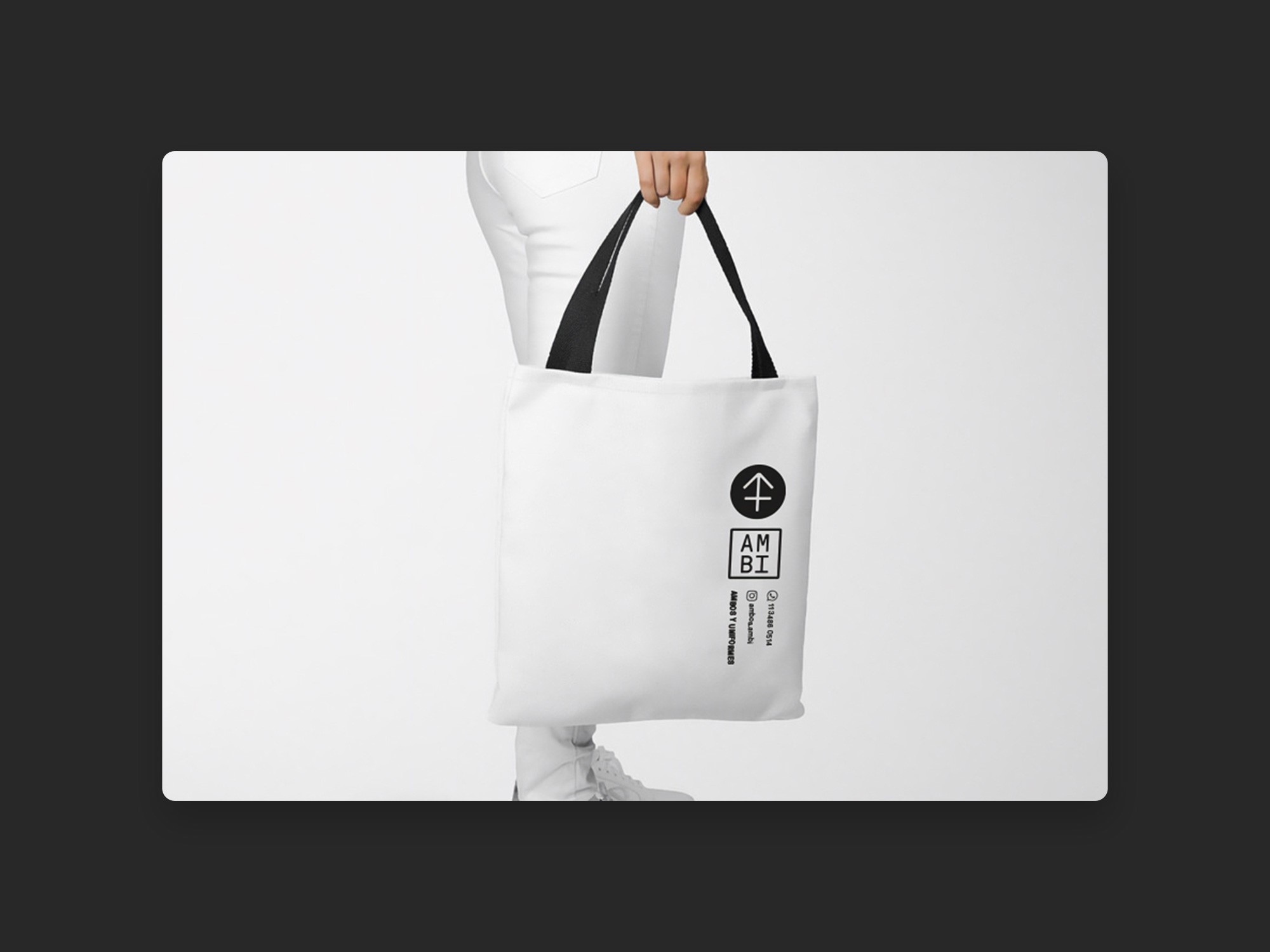
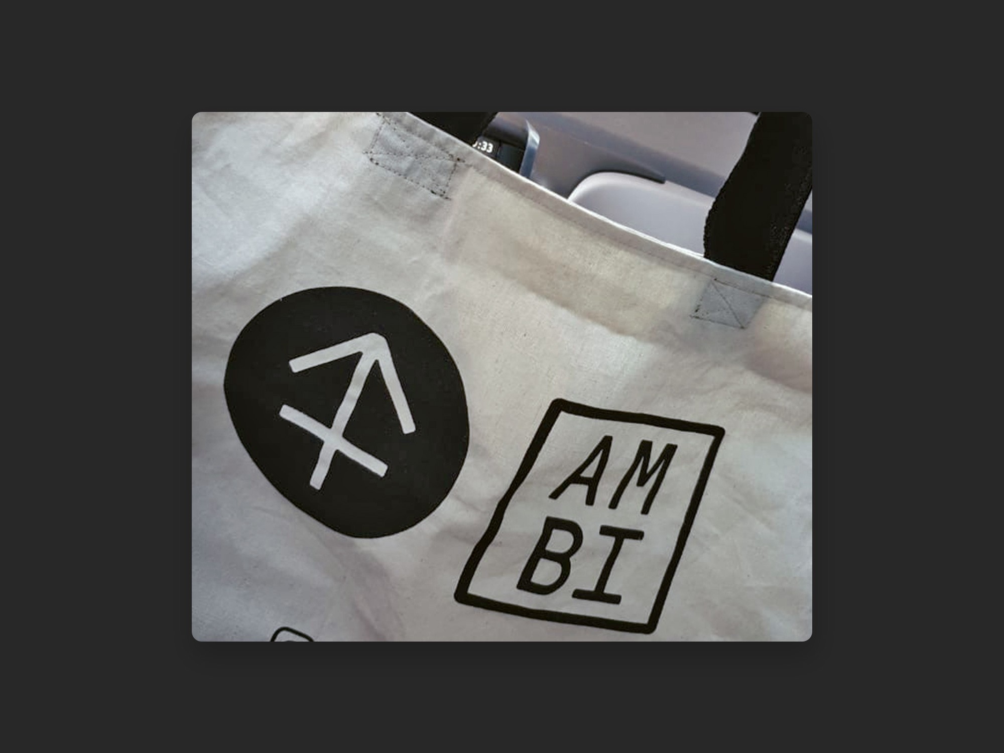
The isotype combines the structure of the letter A with the fundamental elements of the male and female symbols, dissolving their polarity and merging them into a single sign representing both.
AMBI is a truncation of the term ambivalence and a homograph of the prefix ambi-, meaning “in both directions.”
Beyond its thematic pertinence, it also offers a semantic echo in the expression “ambos AMBI” (in english, “AMBI scrubs”), which functions as a mnemonic jingle enhancing the name’s memorability.
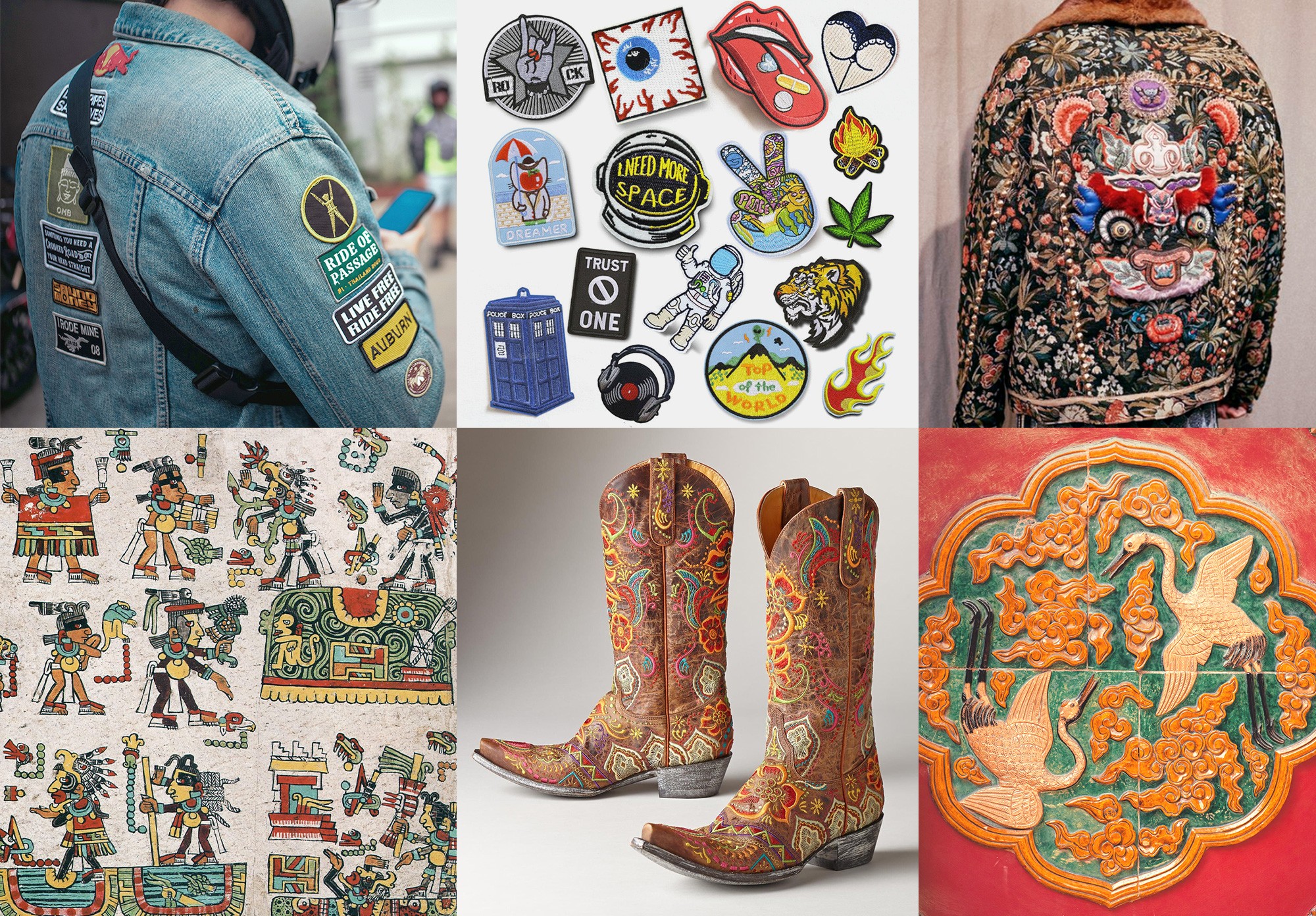
The logotype was designed as a “patch” and deliberately associated with the symbol in an arbitrary and openly disjointed manner.
This morphological decision refers to the randomness found in the placement of embroidered patches, tattoos, and, more broadly, in pre-Renaissance artistic composition — all references to a new concept of non-normative freedom that was spreading among young people at the time.
The layout of the isologotype reinforces the concept of ambivalence by juxtaposing a symbol and a word, each contained in explicitly different frames.
Finally, “Orientalism” was introduced as a contextual layer contributing a sense of sophistication linked to multiculturalism, another relevant value of that period.
This influence is evident in the vertical arrangement of the isologotype and its accompanying texts, evoking Japanese, Korean, or Chinese writing systems.
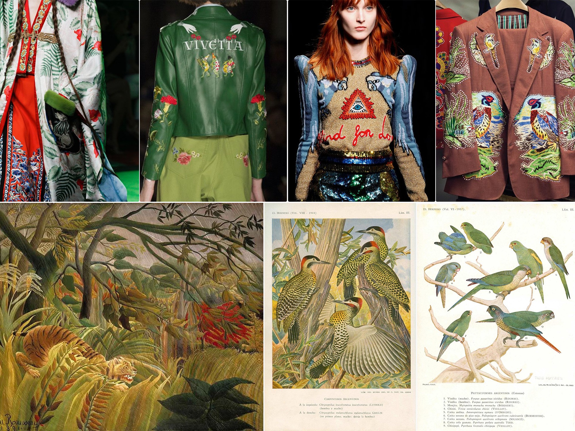
The idea of multiculturality extended throughout the visual compositions, incorporating elements from diverse cultures and eras — particularly the naïf exotism of Henri Rousseau, medieval painting, Mexican maximalism, and descriptive naturalist illustration.
To balance the exoticism and bring the brand back to the product’s functional nature, I selected an eminently mechanical typeface.
The normative, regular aspect of a type that evokes industrial processes re-anchors the identity in the realm of technical disciplines.
This typographic decision validates the ambivalence between two poles: the spiritual, intuitive, natural, and artistic versus the rational, normative, technical, and instrumental.
The outcome was a relaxed and eclectic blend that sought to break conventions, drawing upon the questions raised by the new generations of 2020 about their own lifestyles, their work, their leisure, and the intentionality of the objects they used in everyday activities.